
Brand identity and visual direction
The Underground
A nostalgic identity refined into a more versatile system for modern use.
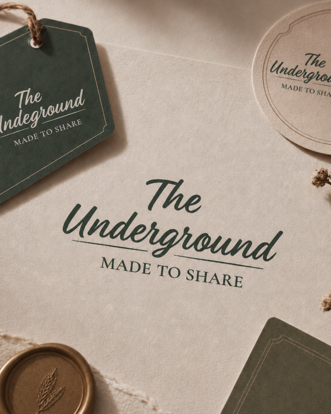
Brand refinement · Visual identity · Social direction
Context
The Underground had a much-loved, home-style character that customers already responded to. The brand needed a clearer system that could extend across proposed packaging, social content and future brand applications.
Luna’s role
Luna developed the "Made to Share" tagline and refined the visual identity, including typography, colour, logo application and social direction.
Three meaningful changes
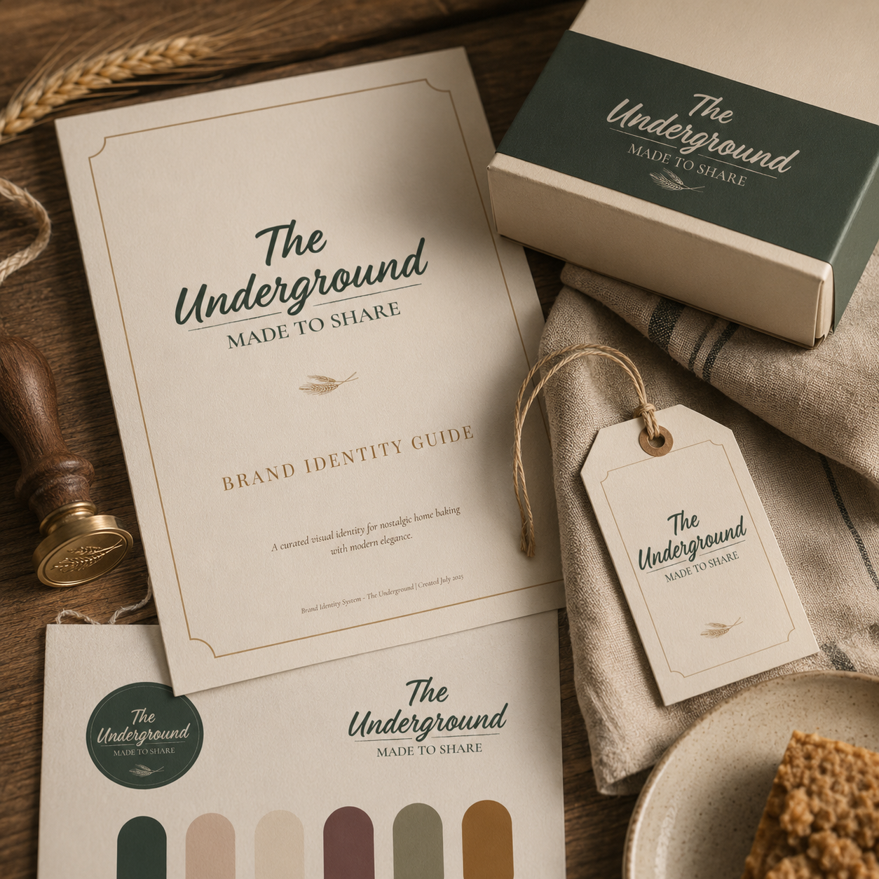
Strengthened the logo system
Preserved the warmth and personality while creating clearer guidance for scale, placement and everyday use.
Clarified the system
Typography and colour given a clear structure so the brand reads consistently wherever it appears.
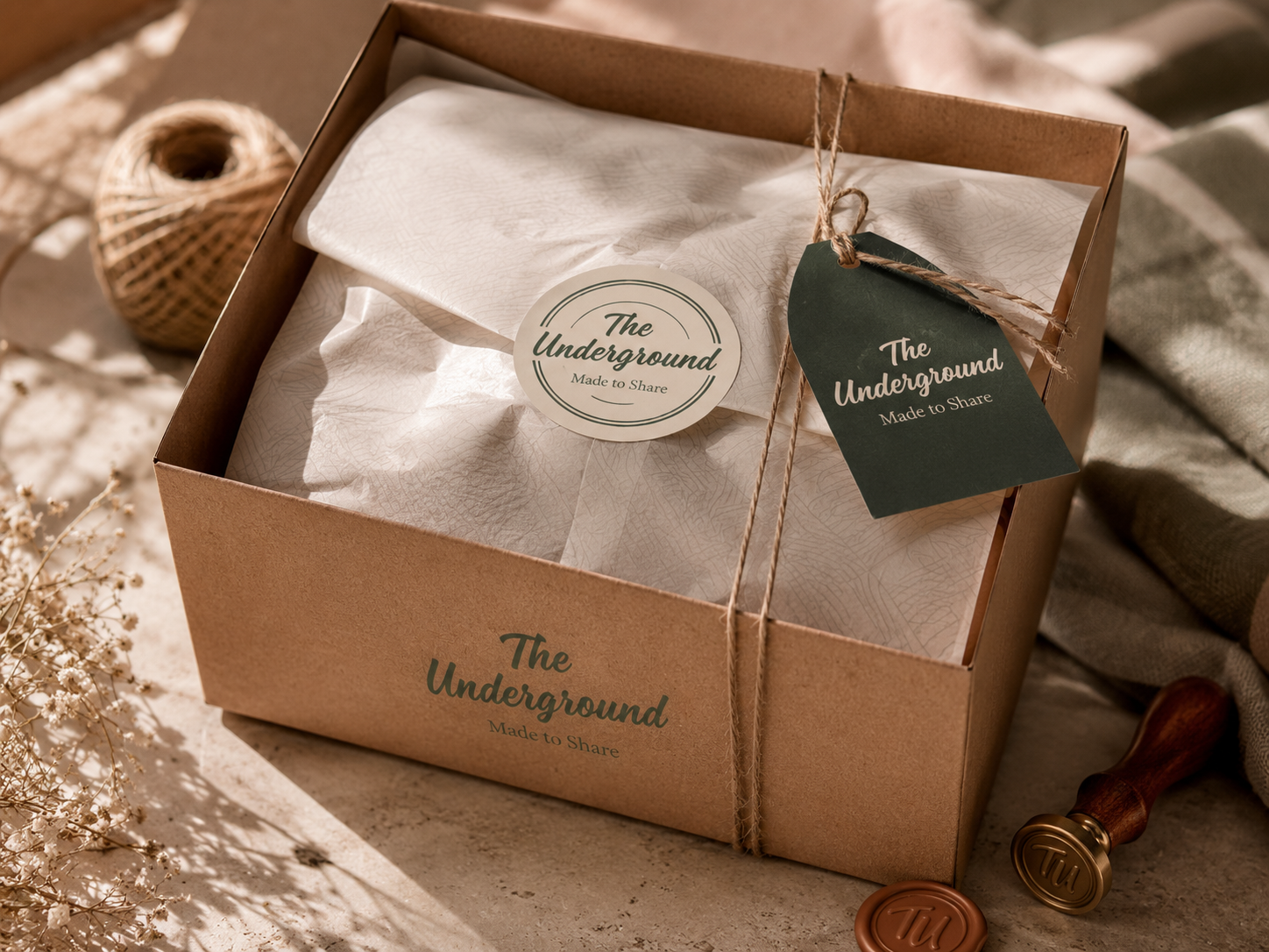
Practical applications
A short set of social templates that protect the personality while making everyday posting easier.
Result
An identity that feels unmistakably like itself, with a more versatile system underneath for the way the business now operates.
Next step